


Imagine having a clear, visual map of how every initiative you launch connects to your most critical business goals. The AI-Powered KPI Performance Diagram Builder from Visual Paradigm makes this vision a reality, turning complex strategic planning into an intuitive, interactive experience. This tool isn’t just a diagramming app; it’s a strategic co-pilot that helps you see the big picture and the intricate connections that drive success. In this deep dive, we’ll explore how this powerful software works, using a real-world example of improving customer retention for a subscription box. We’ll walk through the process of creating a performance map and then learn how to easily share it with your team or stakeholders.
From Blank Canvas to Strategic Blueprint: The AI-Driven Design Process
Let’s start with the first image, which showcases the AI-Powered KPI Performance Diagram Builder in action. The screenshot displays a fully generated diagram titled “Improving Customer Retention for a Subscription Box,” which is a prime example of how this tool can instantly provide a strategic framework. The entire process begins with a simple prompt. You enter your project domain, and the AI does the heavy lifting, generating an initial set of Initiatives, Metrics, and Key Performance Indicators (KPIs) with suggested connections. This solves the classic “blank canvas” problem, giving you a smart starting point that’s already aligned with your business objective.
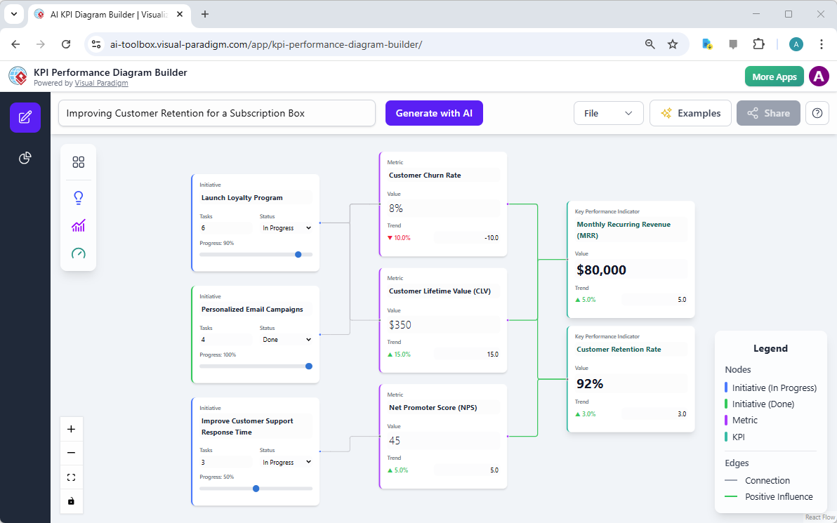
As you can see in the diagram, the AI has populated the canvas with relevant elements. On the left, we see three Initiatives: “Launch Loyalty Program,” “Personalized Email Campaigns,” and “Improve Customer Support Response Time.” Each initiative is a distinct project with its own status (e.g., “In Progress” or “Done”) and a progress bar. These initiatives are the “how” of your strategy—the actions you’re taking. The diagram then shows how these initiatives connect to the “what” and “why” of your strategy: the Metrics and KPIs. For example, the “Launch Loyalty Program” initiative is linked to the “Customer Churn Rate” metric, which is a direct measure of the initiative’s success. This visual connection is crucial for understanding accountability.
The diagram also includes Key Performance Indicators like “Monthly Recurring Revenue (MRR)” and “Customer Retention Rate,” which are the ultimate goals. The AI has intelligently linked the various metrics (like “Customer Lifetime Value” and “Net Promoter Score”) to these KPIs, showing how they collectively drive overall business success. The color-coded legend on the right helps you quickly interpret the state of each node—green for “Done,” blue for “In Progress,” and purple for “Metric.” This level of visual clarity is a game-changer for strategic communication.
Sharing Your Strategic Vision: The Power of a Read-Only Link
Once you’ve created a comprehensive and insightful diagram, the next logical step is to share it with others. This is where the second image comes in. It shows the “Share Diagram” dialog box, a simple yet powerful feature that allows you to instantly generate a unique URL. This URL points to a read-only, interactive version of your diagram, which can be shared with anyone, regardless of whether they have the tool installed.
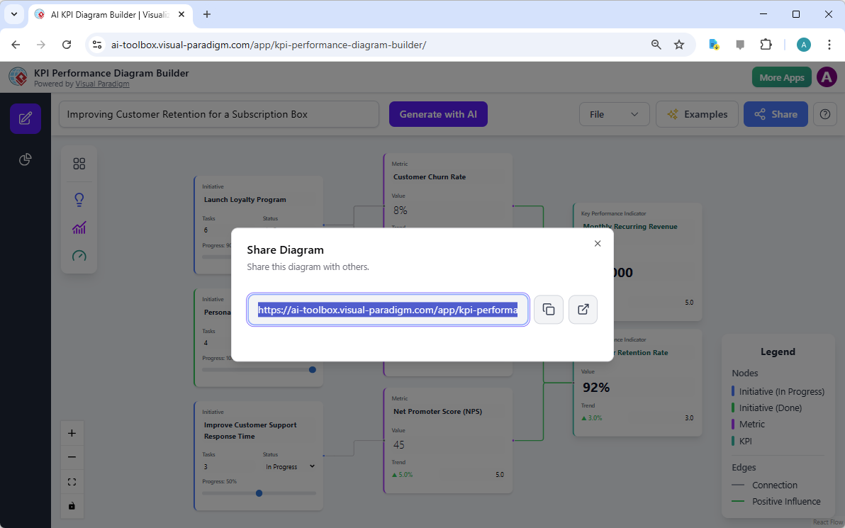
Imagine you’ve spent hours building this performance map. You want to present it to your CEO, your marketing team, or a client. Instead of sending a static PDF or a confusing PowerPoint slide, you can simply copy and paste this URL. The recipient gets a live, interactive view of your entire strategy. They can explore the connections between initiatives and KPIs, see the current status of each project, and understand the data behind the numbers—all without the risk of accidentally changing your original work. This feature is essential for fostering transparency and ensuring everyone is on the same page.
Furthermore, this read-only link is a professional and secure way to collaborate. You can share it in an email, a project management tool, or a presentation. It’s a modern solution that replaces outdated, static documents with dynamic, engaging content. The ability to share a live, interactive diagram is a significant advantage for business strategists, project managers, and consultants who need to communicate complex performance frameworks effectively.
Key Takeaways: Mastering Your Strategic Performance
-
Start Smart with AI: The AI-Powered KPI Performance Diagram Builder eliminates the guesswork. By generating an initial framework based on your project domain, it saves you time and provides a solid foundation for your strategic planning.
-
Visualize the Connection: The interactive canvas allows you to see the direct relationships between your initiatives, the metrics that track them, and the KPIs that measure overall success. This visual clarity is essential for strategic alignment.
-
Generate Actionable Insights: Beyond just creating a diagram, the tool uses AI to analyze your framework and generate reports like executive summaries, performance analyses, and risk assessments. This turns your visual map into a source of deep, data-driven intelligence.
-
Share with Confidence: The read-only sharing feature makes it easy to communicate your strategy to any stakeholder. A simple URL provides a professional, interactive way to present your performance framework.
By leveraging the AI-Powered KPI Performance Diagram Builder, you can transform the abstract concept of “performance” into a tangible, visual roadmap. It’s the perfect tool for anyone who needs to understand and optimize how their operational activities contribute to strategic outcomes.
Ready to build your own strategic performance map? Try the AI-Powered KPI Performance Diagram Builder now and see how it can revolutionize your planning process.
Related Links
Visual Paradigm provides specialized tools for KPI (Key Performance Indicator) management and performance visualization, utilizing AI-powered builders to create real-time dashboards and strategic frameworks to align metrics with organizational goals.
-
Comprehensive Guide to the AI-Powered KPI Performance Diagram Builder: This guide details how to use AI-driven tools to build dynamic, real-time diagrams that support data-driven business intelligence.
-
Understanding the AI-Powered KPI Performance Diagram for a Coffee Shop: A practical application study showing how small businesses can track sales, customer behavior, and operational efficiency using KPI dashboards.
-
Strategy Map Tool – Visualize Your Organization’s Strategic Goals: This tool enables the creation of visual strategy maps that directly link business objectives to specific key performance indicators and initiatives.
-
AI-Powered Balanced Scorecard Software for Strategic Planning: Learn how to leverage AI insights to develop balanced scorecards that monitor performance metrics essential for strategic execution.
-
AI Business Process Improvement Tool – Release Notes: This update introduces an AI tool that can generate diagrams and KPIs automatically from initial process problem statements.
-
Why Visual Paradigm Online’s Flipbook Maker Stands Out: Beyond publishing, this tool is designed to create interactive reports and visually engaging KPI presentations for stakeholders.
-
Radar Chart Tool – Visual Paradigm Features: A specialized feature for building interactive radar charts to analyze and compare complex, multidimensional performance data.
-
AI Diagram Generator Adds Radar Chart Support: This release highlights the use of AI to generate charts for visualizing capability metrics and performance performance trends.
-
Process Improvement Tool – Modeling and Analysis: A data-driven toolset designed to identify workflow inefficiencies by analyzing integrated performance metrics.
-
How to Use Radar Charts for Competitive Analysis: This tutorial provides a framework for using radar charts to benchmark competitors across various performance-related dimensions.
 vpadmin
- Uncategorized
- January 20, 2026